Platform Login

« back to blog overview

Use MkDocs to create your customized documentation

In order to provide instructions on how to use your product you will at some point have to create a documentation homepage. No need to worry, there are already many great frameworks out on the market so you don’t have to reinvent the wheel. We can happily say that we have been using MkDocs from the start to create our documentation homepage. But only recently did we make use of its ability to create a customized documentation. Therefore, the design aligns with our corporate identity. In this blog post we show you how you can easily build your customized documentation.

Quick links

Why MkDocs?

MkDocs is a Python package and allows SEO-friendly static html file generation and is therefore easy to host. It is very simple to use MkDocs as every single page in the documentation is written in Markdown and the pages are organized by a single YAML configuration file. In addition, the built-in dev-server allows you to preview the documentation while you are writing it. Furthermore, you can add various packages as plugins such as a search field to find keywords within documents. Moreover, you can use various themes to modify the look and feel. We are using the popular Material theme in this blog post and on our official documentation page. The customization is done simply via CSS files.

The technical part

mkdocs.yml file

Not yet related to CSS customization, however still a personalization step: the main configuration. The following four lines provide base information for your documentation page:

				
					site_name: The name of your documentation homepage
site_url: https://your-documentation-url.tld/possible-sub-folder
site_description: Description for your documentation homepage
site_author: myAwesomeCompany Inc


For a full description we refer to the official homepage.

Changing colors

You can find a set of predefined color schemes for the Material theme. Their documentation shows how to easily change them.

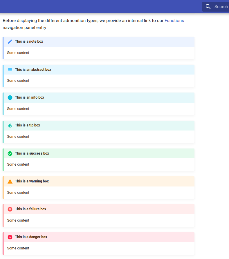
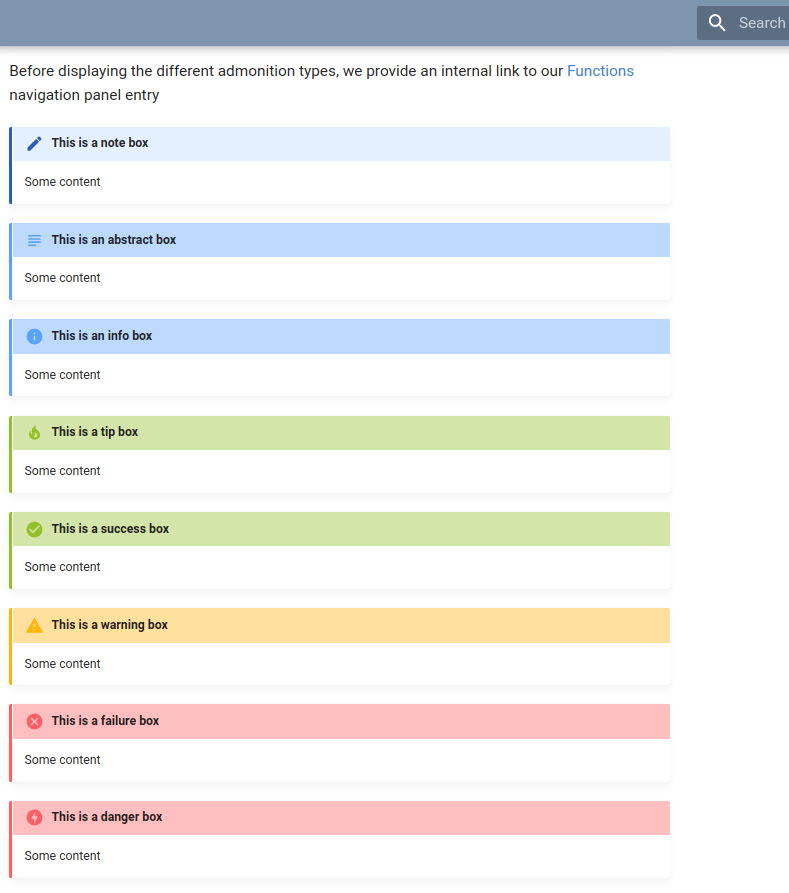
Admonitions – or “info boxes”

A great way to highlight important information within the Material theme is to use so-called admonitions. Here you can find a list of supported types. All those boxes come with their own color. Later on, we show you how to adapt the admonition colors to fit your corporate identity.

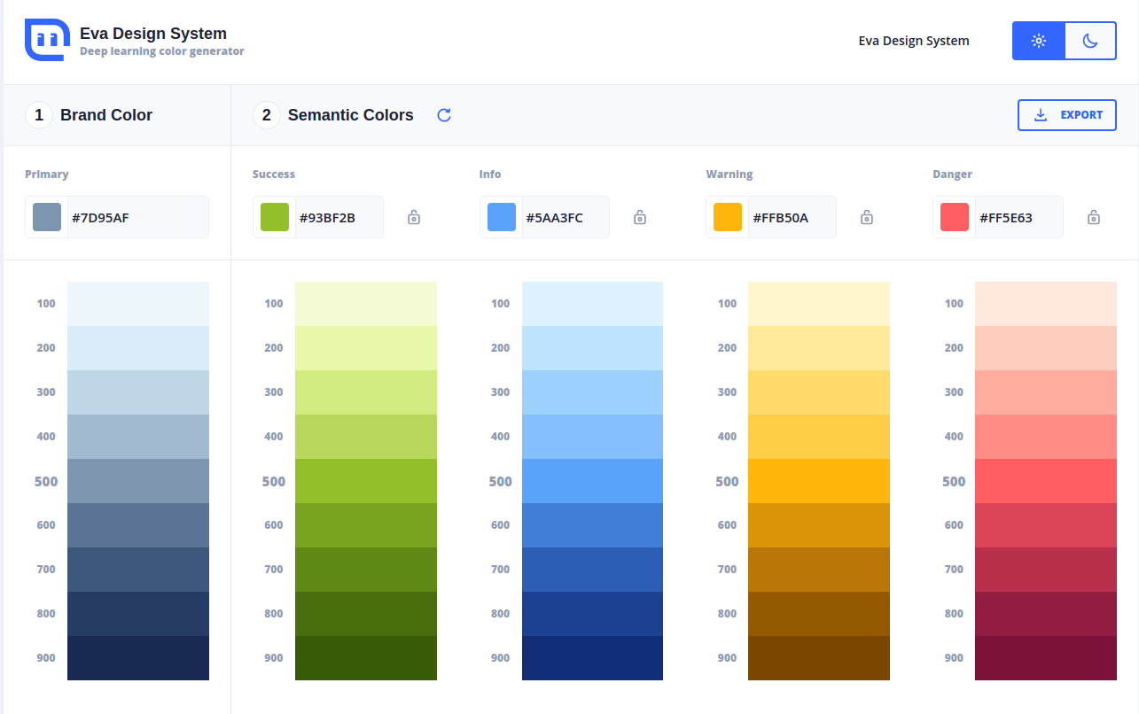
How to pick the “right” colors?

You might have your primary color available for your brand but how do you know which semantic colors you should pick? There is a great homepage https://colors.eva.design/ that uses AI to generate semantic colors which go well with your primary color. Below we share a screenshot, where we entered the primary color #7D95AF and obtained an entire color palette.

Luckily there is an export button for JSON, so you don’t have to copy all the color codes by hand. However, we will need the color definitions in CSS format. For instance, you have saved the above color palette as custom-theme.json, then you can use the following bash command to obtain a valid CSS definition:

				
					(echo -n ":root" && cat custom-theme.json | tr -d '"' | sed 's/color/--color/g;s/,$/;/g;s/)$/);/g') > custom_colors.css


Just as a side note, if you are interested what the longish command actually does:

  • Define CSS for the “root” scope
  • Trim any quotes
  • Include double dash before “color”
  • Replace comma at the end of line with semicolon
  • Insert a semicolon after the last entry

Custom CSS file

The Material documentation provides information on how to adapt the color definitions. In the mkdocs.yml file you just need change the following from

				
					theme:
    name: 'material'
    language: 'en'
    palette:
        primary: 'indigo'
        accent: 'indigo'
    font:
        text: 'Roboto'
        code: 'Roboto Mono'
..


default configuration

to

				
					extra_css:
    - 'css/extra_css'

theme:
    name: 'material'
    language: 'en'
    #palette:
        #primary: 'indigo'
        #accent: 'indigo'
    font:
        text: 'Roboto'
        code: 'Roboto Mono'


current configuration

Note that the palette section needs to be uncommented otherwise the custom CSS settings don’t take effect. All you need to do from there on is to create a css folder in the docs directory and define the extra.css file.

See our GitHub repository for the entire code.

The result

Below we show the screenshots of the web page with standard colors and then with customization.

We have hosted both version for you to click around. The standard theme and the custom theme.


Standard theme (indigo).


Custom theme.


Enjoy building your customized documentation using MkDocs and Material 🙂

Interested to know more?