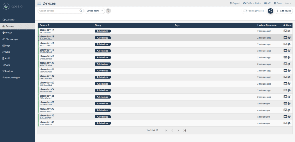
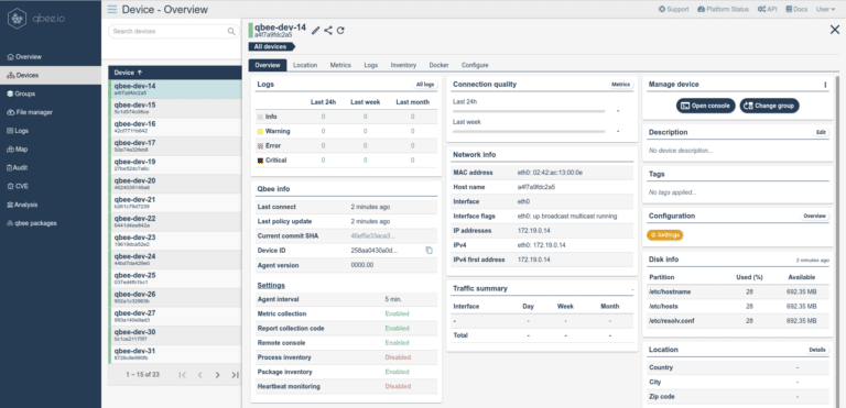
Our device fleets are growing rapidly and this mandates a user interface that can handle thousands or millions of devices. The updated “Devices” and “Groups” page will make it easier to handle your large fleets. In addition, we hope that you find the new design and UX more intuitive. We strongly believe that the new UI will make you more productive and it is easier to compare devices or find necessary information. The search bar allows for a context sensitive search of all parameters that are available in the qbee database. Searches can be bookmarked by the browser. When browsing through individual devices the scope of the information viewport is kept. This allows for quick comparisons.
This is the first re-design in a planned refresh of the overall interface. Any input, ideas or feedback is highly appreciated. Just reach out to us by mail or contact form.


